Option A shows a cause and effect diagram, also known as a fishbone diagram or an Ishikawa diagram1. This is a tool that helps to identify and analyze the root causes of a problem by displaying the possible causes and effects in a graphical format2. A cause and effect diagram can help the project team to determine whether the particular cause and effect are related by using a systematic and logical approach, such as asking “why” questions or using the 5 Whys technique34. A cause and effect diagram is better than the other options because:
Option B shows a Gantt chart, which is a tool that helps to plan and track the tasks, dependencies, durations, and resources of a project along a timeline5. A Gantt chart does not focus on the causes and effects of a problem, but rather on the sequence and progress of the project activities.
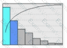
Option C shows a pie chart, which is a tool that helps to compare and visualize the proportions of different categories or segments of data6. A pie chart does not show the relationships between the causes and effects of a problem, but rather the distribution of the data values.
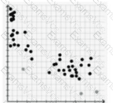
Option D shows a scatter plot, which is a tool that helps to examine the correlation or association between two variables or sets of data7. A scatter plot does not show the causes and effects of a problem, but rather the pattern or trend of the data points.
References = CompTIA Project+ Certification Study Guide8, CompTIA Project+ Certification Exam Objectives9, Cause and Effect Diagrams for PMP1, Cause and Effect Analysis: Using Fishbone Diagram and 5 Whys2, How to Create a Cause and Effect Diagram3, How to Use Cause and Effect Analysis to Solve Business Problems4, What is a Gantt Chart?5, What is a Pie Chart?6, What is a Scatter Plot?7